SQL Server Reporting Services (SSRS) is getting quite the overhaul in SQL Server 2016. Lot’s of things are changing:
And these are all awesome changes. But sometimes it’s the little things that make me smile.
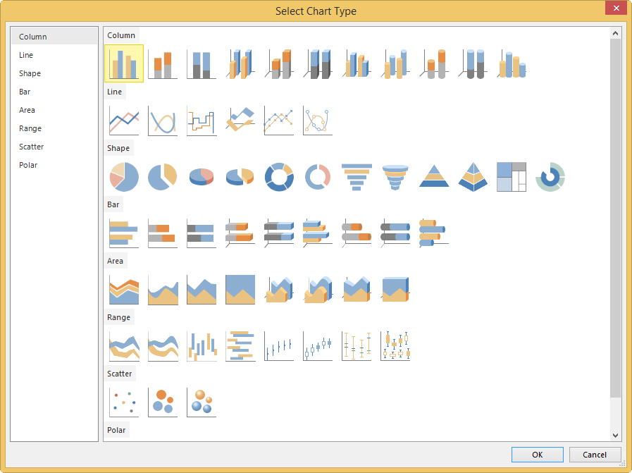
For example, I was toying with SSRS 2016 CTP3.0 and I wanted to insert a new chart. Suddenly I noticed they had updated the little chart icons in the dialog:
You can find a screenshot of the old dialog in the sunburst article.
How neat is that?
The slides for my session "The €100 data warehouse on the Azure data platform" can…
A good week ago I hosted the monthly T-SQL Tuesday blog party. I invited the…
It's the second tuesday of the month, which means T-SQL Tuesday time! This month's topic…
It's time for T-SQL Tuesday again! And we're almost to number 200! T-SQL Tuesday is…
A while ago we suddenly had an error while trying to deploy one Fabric workspace…
I've uploaded the slides for my Techorama session Microsoft Fabric for Dummies and my DataGrillen…