The pie chart should be avoided at all costs. Why?
For these reasons, it’s almost always better to replace the pie chart with a bar or column chart. The only exception is when you have a very limited number of slices (maximum 3 but I prefer 2). In this case, the “part of a whole” relationship can be quite accurately displayed. It’s useful for “omg look how big that slice is compared to the other tiny slice”. An example:
If you do have to create a pie chart, adhere to these simple rules:
Now, why the reason of this blog post (most of this has already been described before)? I was recently reading the blog post What’s More Popular: SQL Server 2014, or SQL Server 2005? by Brent Ozar (blog | twitter) and it linked to yet another fine specimen of pie chart junk (note: the chart was not created by Brent, just to be clear). It’s a very interesting post – with an interesting discussion in the comments as well – about the adaptation rate of the different SQL Server versions among a large sample of Dell servers.
The problems are quite clear, since the chart doesn’t follow any of the rules I explained earlier. There are too many slices and thus too many colors as well. Could you see that 2014 was the double in size of 2000, without using the labels?
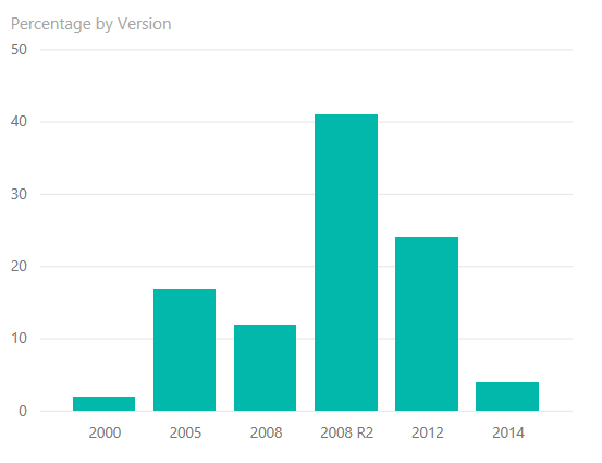
I imported the data in Power BI and quickly created this column chart:
Much more clear, isn’t it? And only one color needs to be used. In the discussion on Brent’s blog someone suggested to sort the data not on size, but rather on release date, which makes this graph actually much better since there is some sort of time aspect related to the data. It’s obvious to see now 2005 is still more popular than 2008 and 2014. You can now also clearly see 2014 is bigger than 2000.
The chart has a skewed normal distribution to the right, which might be expected for adaptation rates of a technology product, but you can see 2005 and 2014 are somewhat outliers. I tend to believe SQL Server 2014 didn’t really had anything substantial to offer; certainly not for BI – aside from the clustered columnstore index, which on itself is not a reason to upgrade – and if your shop didn’t need in-memory OLTP there was no actual reason to upgrade.
SQL Server 2016 on the other hand, will be awesome 🙂
A good week ago I hosted the monthly T-SQL Tuesday blog party. I invited the…
It's the second tuesday of the month, which means T-SQL Tuesday time! This month's topic…
It's time for T-SQL Tuesday again! And we're almost to number 200! T-SQL Tuesday is…
A while ago we suddenly had an error while trying to deploy one Fabric workspace…
I've uploaded the slides for my Techorama session Microsoft Fabric for Dummies and my DataGrillen…
I'm doing a small series on indexing basics for SQL Server, and on May 14th…