NOTE: the DAX presented in this blog post is written in my locale (nl-BE). This means that semicolons are used in the functions and lists instead of commas. Also, we use the comma as the decimal seperator. 0.95 (in the US) is 0,95 in my locale. A couple of well placed search and replaces should fix those issues if you are in another locale.
Yesterday I published the blog post Dynamically Changing Shapes in Power BI, which seemed to be quite popular in social media. It showed a lot of people were struggling with this issue and that some people had also found (alternative) solutions for it. In the comments of that blog post, you can find a solution proposed by Jason Thomas (blog | twitter). Jason has quite the Power BI & SSRS knowledge and he has found a cool trick to solve our changing images problem. In this blog post, I’m going to explain the solution step-by-step.
First of all, we have to create a disconnected table that will store the URL of our images, along with a short description. You can do this in DAX by using a calculated table:
Images = DATATABLE (
    "ShapeURL"; STRING;
    "State" ; STRING;
    {
        { "https://sqlkover.com/wp-content/uploads/2017/02/thumbsup.png";"ThumbsUp"};
        { "https://sqlkover.com/wp-content/uploads/2017/02/thumbsdown.png";"ThumbsDown"}
    }
)
The next step is to create a measure. This measure will calculate a filter value, which we are going to use later on to filter our visual.
FilterValue = SUMX(
                    VALUES(Images[State]);
                    SWITCH(Images[State];
                                "ThumbsUp";
                                    IF(CALCULATE(
                                                    AVERAGE(ServerAvailability[availability])
                                                ) > 0,95
                                            ;1
                                            ;0
                                      );
                                    IF(CALCULATE(
                                                    AVERAGE(ServerAvailability[availability])
                                                ) > 0,95
                                            ;0
                                            ;1
                                        )
                        )
               )
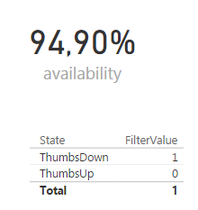
We can visualize the result in a table:

Let’s take a closer look at this measure.
- SUMX(VALUES(Images[State]);…). This is an iterator. It goes over the rows of a table and will calculate an expression for each row of that table. At the end, the results are aggregated using Sum. Here the table is the result of the VALUES function, which gives two rows: ThumbsDown and ThumbsUp.
- The next step is evaluating the SWITCH function. If the current row is equal to ThumbsUp, it will evaluate an IF statement. If it’s not, it will evaluate another IF statement.
- The IF statement checks if our server availability is higher than 95%. If it is, the result is 1 (for ThumbsUp) and if it’s not, the result is 0. If the current row is ThumbsDown, the logic is the other way around: if the availability is higher than 95%, the result is 0, otherwise 1.
- We need to put CALCULATE around AVERAGE(ServerAvailability[availability]). This is needed to transfer from a row context into a filter context. If the images table had a relationship with the fact table, the current row would have an impact on the filter context. However, we are using a disconnected table, so the filter context is the same for both rows. In other words, the calculated measure returns the same result. It’s the IF statements that decide if a 0 or a 1 is returned.
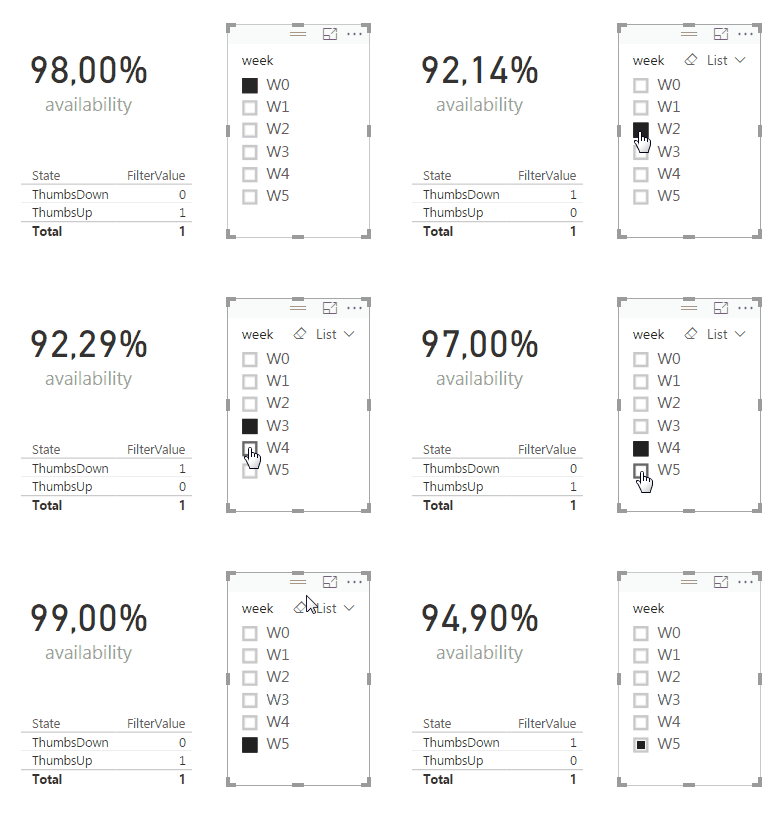
- When we take a look at the example above – availability = 94.90% – and we follow the logic, we can see that ThumbsDown has a filter value of 1 (meaning availability < 95%) and ThumbsUp has a filter value of 0. The total row repeats the same process and aggregates the result: 0 + 1 = 1.
In the following animation you can see how our table behaves when we change the availability:

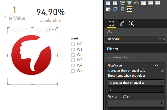
The next step is to use the custom visual Image Viewer to show our image. In the filter area, we add the FilterValue measure and we configure it to be greater than or equal to 1.

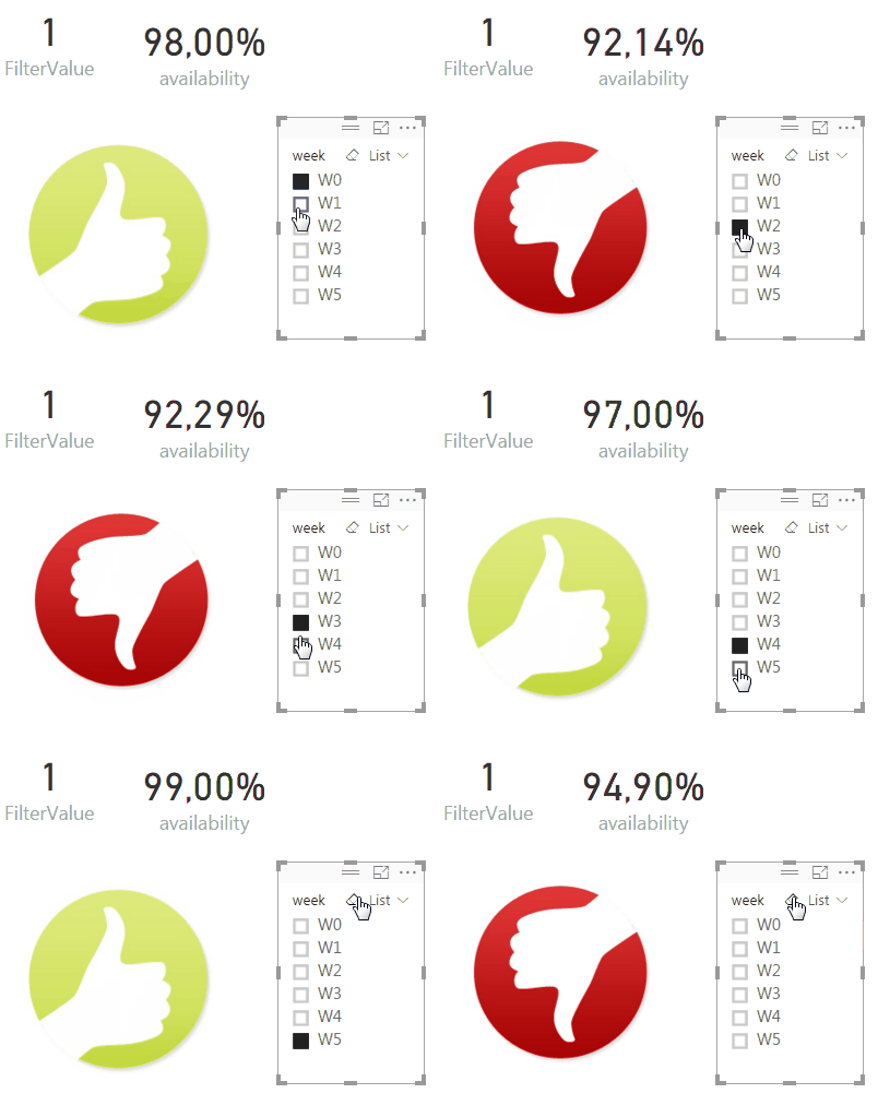
Now our image behaves the same as our table:

The clue behind this is that the Image Viewer visual still internally behaves like the table: there are rows you can loop over and thus rows that you can filter out. I didn’t realize this at first (I just thought the visual took the first image it could find if multiple images are provided).
The advantage of this solution is that you don’t have the dependency on R code and this solution will certainly work in PowerBI.com. The disadvantage is that you can only use image URLs, you cannot load images from disk (and there’s no option to load images in the model, like you can in PowerPivot).
Someone else suggested to use a calculated column, but then you lose all flexibility. If you have a report where the condition of the shape only needs to be determined when the model refreshes, than calculated columns are certainly a good option.
Will Thomson of the Power BI team had the following suggestion:
@Ko_Ver I have a no-code version… Still a workaround (multiple Card visuals stacked on top of each other but hey, it works. Also, animals! pic.twitter.com/z51c3Kkheu
— Will Thompson (@Will_MI77) February 8, 2017
Unfortunately, you cannot add a filter to a card visualization, so again, we lose the flexibility we have when working with measures. A last alternative – if you don’t like custom visuals – is using a table. The principle is the very same as when you use the Image Viewer. However, in a table you have almost no control over the size of the image.
------------------------------------------------
Do you like this blog post? You can thank me by buying me a beer 🙂
Hi Koen,
This is a great idea, we like it so much! Thank you!
The only question can it be used for a real-time streaming dashboard in Power BI? Would be great to show some KPI with dynamically changed images there.
Best regards,
Tina
Hi Tina,
I’m not sure you’re able to define extra measures on top of a streaming dataset.
(at least, I haven’t found any example where they do this)
Since the dataset only exists in the service, I can’t seem to find a way to add extra DAX measures.
Very good idea though, I hope it becomes possible in the future.
Hi Tina,
I’m trying something similar. Just curious to know, did you able to achieve this in Power BI service.
Regards,
Rajat
Hi Koen,
What if I have more than 2 images, say 3 options “S”, “M”, and “L” instead? In addition to modifying the FilterValue measure, how can I configure the filter area of visual Image Viewer?
Best regards,
Julian
Hi Julian,
it actually doesn’t matter how many images you have. You just have to construct your FilterValue measure in such a way that only one image results in 1 and all the others in 0.
Example:
instead of “> 95” and “<= 95", you can do "< 50" ,">= 50 and <= 95" and "> 95″.
Hi Koen,
Thanks for your instructions. I’ll try it accordingly.
Regards,
Julian
OK, let me know how it went 🙂
Hi KOEN:
Would you mind writing down the codes for the” FilterValue” in this case here:
Example:
instead of “> 95” and “< = 95", you can do "= 50 and 95″.
By the way, you have done terrific work with this -Dynamically Changing Shapes- articles. I have been trying both successfully. They are great!
Congratulations!
Hi Koen,
I’ve put R script and DAX formula in one PowerBI desktop file following your instructions and both versions run smoothly, but the image refreshing with R script seemed a little bit slower than that from image viewer. As to the third image, as I don’t have my own website to store the image files, so I just tried the R version to retrieve my local images with the modified measure as shown below:
ImageURL = IF(AVERAGE(Table1[availability]) > 0.97,”C:/Users/Julian/Pictures/thumbsup.png”,IF(AVERAGE(Table1[availability]) >= 0.95, AND(AVERAGE(Table1[availability]) <= 0.97,"C:/Users/Julian/Pictures/fair.png"),"C:/Users/Julian/Pictures/thumbsdown.png"))
However, when I sliced wk1 and wk4 with the availability values falling in the range between .95 and .97 I got the following error message:
MdxScript(Model) (1, 199) Calculation error in measure 'Table1'[ImageURL]: Cannot convert value 'C:/Users/Julian/Pictures/fair.png' of type Text to type True/False.
Does it mean the R script needs further modifying accordingly? Please comment. Thanks.
Regards,
Julian
There’s a problem in your measure:
AND(AVERAGE(Table1[availability]) –> there’s no second parameter and the final ) is missing
Remove the AND and it should work.
Sorry, I’m a little slow to the nested if statement. Could you please give me the exact measure instead? Sorry for bothering you so much.
I worked it out finally after trial and error. Please forget my previous reply. Thanks.
Julian, i have the same problem of you, can u help me plz.. How can I resolve the issue?
Hi James,
can you give us a bit more info on your problem?
James,
I guessed you were talking about the nested IF statement. If this is the case, please refer to the following fixed script:
ImageURL = IF(AVERAGE(Table1[availability]) > 0.97,”C:/Users/Julian/Pictures/img1.png”, IF(AVERAGE(Table1[availability]) >= 0.95, “C:/Users/Julian/Pictures/img2.png”,”C:/Users/Julian/Pictures/img3.png”))
Regards,
Julian
Any suggest if I want use 3 variable up, down or middle. Thanks
Julian already asked the same question. It doesn’t matter how many images you have. You just have to build the right case expression so that only one image has the value 1 at a given point in time, and all the others have 0.
Is there any way to do this based on simpler boolean statement? If row value is TRUE then 1 image, else display another image
Hi Betzalel,
you probably can. In the example here, you need a measure though, so you’ll need to get the “row value” into a measure.
Hello,
if instead to have a value, i.e. 0,97, we have a word? I would like to show an image based on a word. I have a table with Approved and Rejected words. How I can link the “ThumbsUp” to the word “Approved” and “Thumbsdown” to the word “Rejected”?
Thanks in advance.
Hi Marc,
I would model this like you would in a regular dimension with pictures for certain members.
For example, a table with movie titles that also contains the movie poster or a list of countries and their flags. The only difference is that you might store the images in a separate table, linked to the original table with a relationship.
Hi,
Im using this to create a visual dashboard (or trying to) i’ve successfully managed to get the table to work and when i only have a single image to load it works fine, however when i attempt to load a second image neither load.
I have attempted creating a second data table with the image URLs and linking the new image to that however it still leaves both blank.
Any thoughts?
I have the same issue. I
used a workaround: add another column with the same url in the IMAGES table and use copy column in the second visual, then the 2 images are shown correctly.
but this implies that you need a seperate column per visual, not very user friendly if you have multiple visuals in your dashboard.