SQL Server Reporting Services (SSRS) is getting quite the overhaul in SQL Server 2016. Lot’s of things are changing:
- new look ‘n feel for Report Builder: Report Builder Changes in SQL Server 2016
- new chart types (check out my sunburst, treemap and heatmap articles)
- a (somewhat) customizable parameter pane
- HTML 5 support
- and many, many other stuff (see also What’s new in SSRS)
And these are all awesome changes. But sometimes it’s the little things that make me smile.
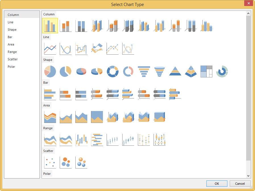
For example, I was toying with SSRS 2016 CTP3.0 and I wanted to insert a new chart. Suddenly I noticed they had updated the little chart icons in the dialog:
You can find a screenshot of the old dialog in the sunburst article.
How neat is that?
------------------------------------------------
Do you like this blog post? You can thank me by buying me a beer 🙂
