SQL Server Reporting Services (SSRS) is getting quite the overhaul in SQL Server 2016. Lot’s of things are changing:
And these are all awesome changes. But sometimes it’s the little things that make me smile.
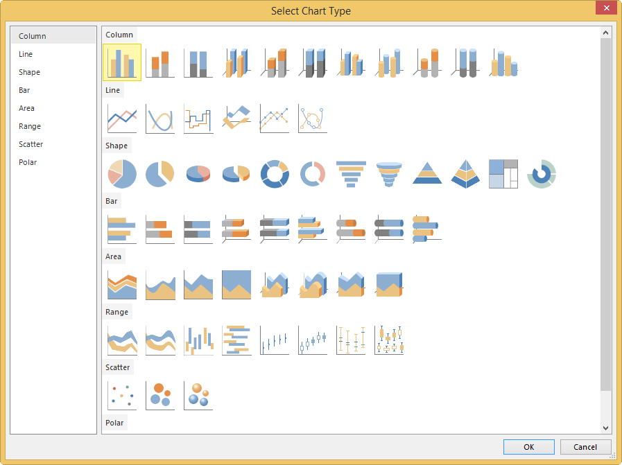
For example, I was toying with SSRS 2016 CTP3.0 and I wanted to insert a new chart. Suddenly I noticed they had updated the little chart icons in the dialog:
You can find a screenshot of the old dialog in the sunburst article.
How neat is that?
I'm starting a webinar series about SQL Server indexing with the fine folks of MSSQLTips.com.…
A while ago I blogged about a use case where a pipeline fails during debugging…
Quite the title, so let me set the stage first. You have an Azure Data…
At Saturday the 21st of February I'm presenting an introduction to dimensional modelling at dataMinds…
I'm not trying to start up a debate whether you should use tabs or spaces…
The Power BI Enhanced Report Format (PBIR) will soon become the default, and that's a…