There’s a new update out of Power BI Desktop (May 2016), but at the time of writing there’s no official announcement yet.
However, two great new features have been spotted by Chris Webb:
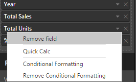
I installed the new PBI Desktop and tried those out. On an imported data set, you can click an arrow next to a measure, giving you the options to either define conditional formatting or to redefine the measure as a quick calc.
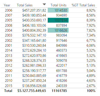
On the Total Units measured, I tried to format it that if the value is bigger than 1,000,000, a color was to be shown. However currently the conditional formatting works as a gradient. This means you can specify a lower limit Everything below this limit will get the color of this limit. The closest I could get was giving the lower limit the color white. In that case, the values above 1,000,000 are colored but they get different shades:
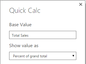
As you can see in the screenshot, I also defined the following quick calc on the Total Sales measure:
To do this, you have to add the measure twice, just like in an Excel Pivot Table.
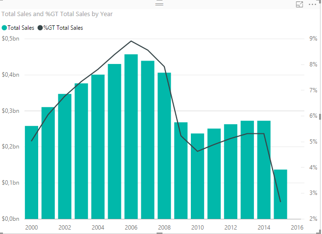
It seems the quick calcs are supported in most visualizations:
The conditional formatting is currently only supported in a tabel visualization. Futhermore, it seems Analysis Services Multidimensional doesn’t support quick calcs, so it’s possible not all sources are currently supported. More info will come soon I guess.
I'm starting a webinar series about SQL Server indexing with the fine folks of MSSQLTips.com.…
A while ago I blogged about a use case where a pipeline fails during debugging…
Quite the title, so let me set the stage first. You have an Azure Data…
At Saturday the 21st of February I'm presenting an introduction to dimensional modelling at dataMinds…
I'm not trying to start up a debate whether you should use tabs or spaces…
The Power BI Enhanced Report Format (PBIR) will soon become the default, and that's a…
View Comments
What about SSAS tabular? Does it support quick calc?
No idea actually :)
I currently don't have Tabular installed, so I can't test.