In the December 2020 release of Power BI Desktop, a long-awaited feature was added as a preview: small multiples (also known as trellis chart). A feature request for this chart type has been made since 2015!
Small multiple charts are a set of charts of the same type on a grid, allowing you to easily compare values over the different charts. From Wikipedia:
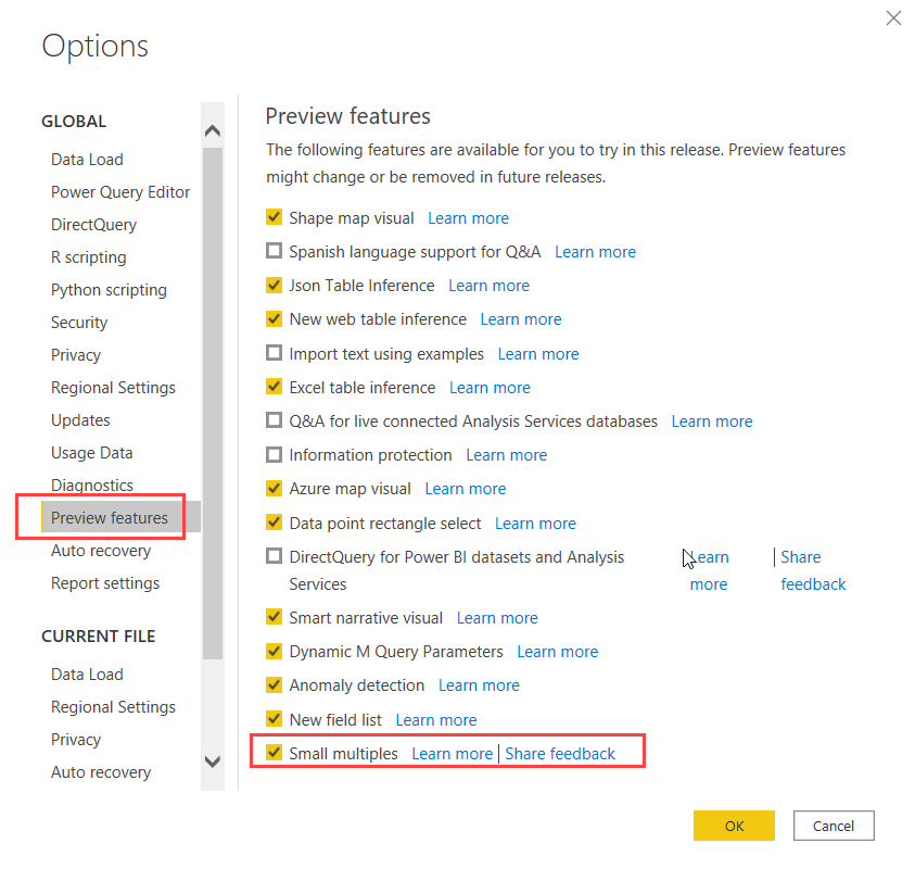
How can we make such a chart in Power BI? Well, for starters, you need to enable the preview in the options:
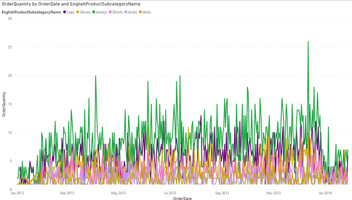
Once you’ve restarted Power BI Desktop, you can start to use it. To demonstrate, I’ve imported some data from the AdventureWorks data warehouse. Suppose I want to plot the order quantity of the Clothing subcategories over time:
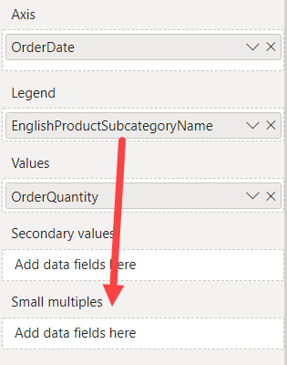
Whoops, there’s so much data in one graph it has become an illegible mess of spaghetti. Small multiples to the rescue! In the visualizations menu, drag the subcategory name from the legend to the small multiples box:
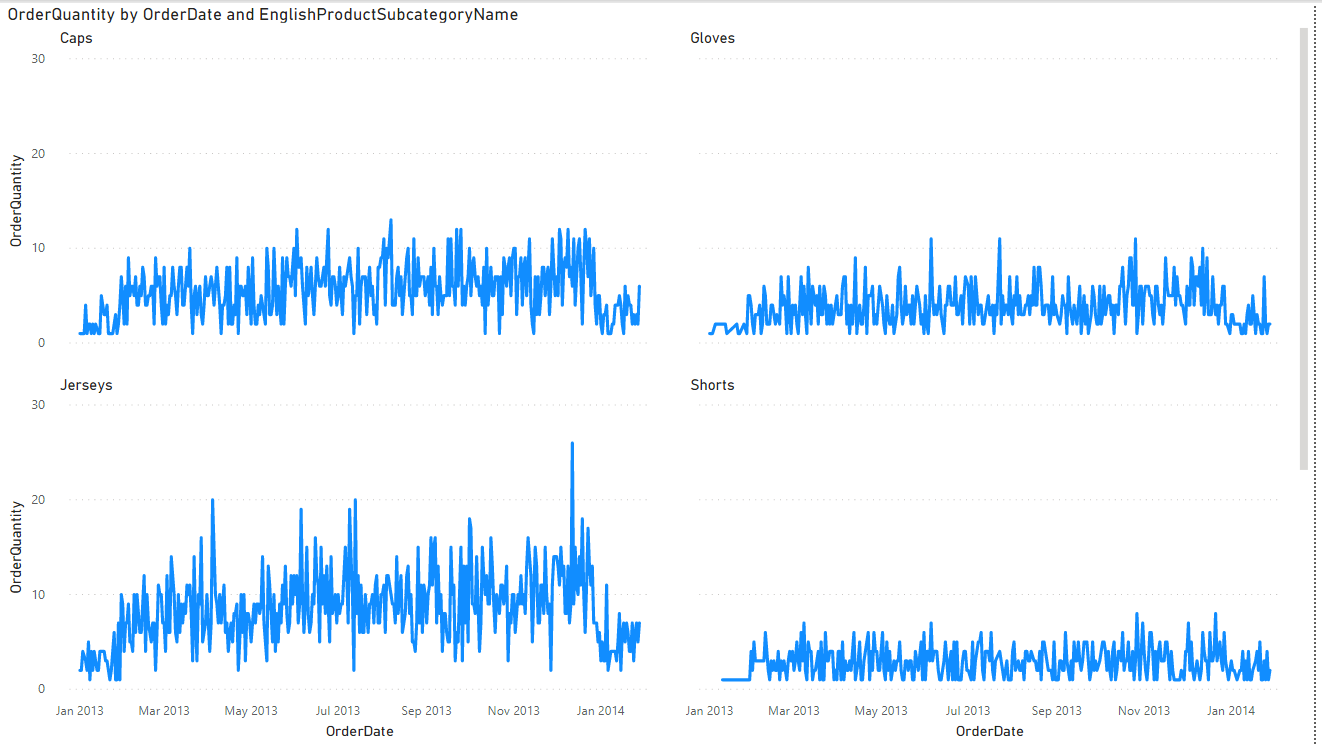
Et voila:
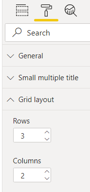
There’s one problem though: there are 6 subcategories and the chart only shows 4. Which means you have to use the scrollbar to see the last two. This is something you’d want to avoid on a dashboard. Luckily we can adjust this. With the chart selected, go to the format pane and change the grid layout to either 3 rows or 3 columns.
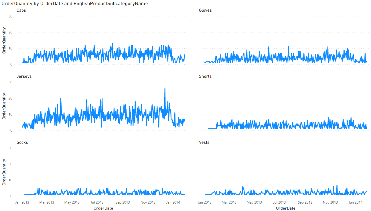
Now everything fits on one page:
I like how Power BI doesn’t unnecessarily repeat axis for every chart, but rather displays them only on the left on the bottom of the trellis chart. Also, all charts have the same scale (0 to 30 in our example), which means it still makes sense to compare the different graphs with each other.
With the introduction of the possibility to transform certain chart types into small multiples, Microsoft has finally closed some gaps between Power BI and other BI tools.
I'm starting a webinar series about SQL Server indexing with the fine folks of MSSQLTips.com.…
A while ago I blogged about a use case where a pipeline fails during debugging…
Quite the title, so let me set the stage first. You have an Azure Data…
At Saturday the 21st of February I'm presenting an introduction to dimensional modelling at dataMinds…
I'm not trying to start up a debate whether you should use tabs or spaces…
The Power BI Enhanced Report Format (PBIR) will soon become the default, and that's a…